RTT quartiles versus geographical distance
Use the following link to download the data used to render this graph in ASCII, comma-separated values format here: (
CSV output)
Description
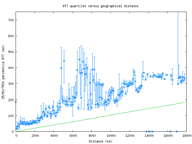
This graph shows the quartiles (25th, 50th, and 75th
percentiles) of round-trip times (RTTs) versus geographical distance from
the probe source. The distance is calculated by looking up every hop's
latitude and longitude via NetAcuity and comparing with the location of the
source. The RTTs and distances are binned (to every 3 ms and 100 km,
respectively) and sorted to calculate their quartile values. The straight
green line represents the theoretical best RTT (given the speed of light in
fiber) for a distance. The y-axis maxes out at 750ms, because of the
occasional high-RTT result which skews the graph.
Motivation
By comparing RTT values with distance, we can see how much that distance
dominates the speed at which packets travel. The quartile view removes
the outliers that show up on the
density
plot and presents a cleaner view of RTT values.
Background
The round trip time for a (IP level) hop is the time (in milliseconds) that
it takes for a packet to be sent from an Ark monitor to that hop and for
that hop's response to be received by the monitor. Non-responding hops are
ignored, and hops in a routing loop are removed.
Analysis
In general, a monitor with high-speed connectivity to the rest of the
Internet will have median RTTs that rise linearly with distance.
Unfortunately, for distances with only a few data points, the quartile view
can give confusing results, with statistically unimportant but visually
impressive ranges.
![[CAIDA - Center for Applied Internet Data Analysis logo]](https://www.caida.org/images/caida_globe_faded.png "Go to CAIDA home page")