
Archipelago Monitor Statistics
Archipelago (Ark): CAIDA's active measurement infrastructure serving the network research community since 2007.
Statistical information for the topology traces taken by this individual Ark monitor is displayed below. See the main statistics page for the full list of monitors
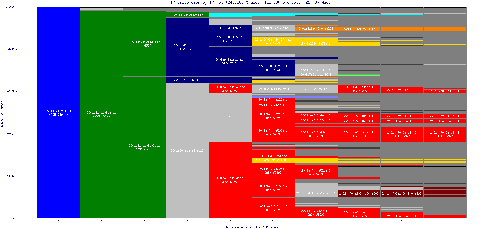
IP Path Dispersion (by IP Hop)
-
6509 CANARIE-NTN - 6939 HURRICANE - 53904 CANARIE-INC - 2603 NORDUNET - 1299 TELIANET - 2914 NTT-COMMUNICATIONS-2914 - 58453 CMI-INT-HK - 11537 ABILENE - 7922 COMCAST-7922 - 6762 SEABONE-NET - 3356 LEVEL3 - 4134 CHINANET-BACKBONE -
Uses
The IP-level dispersion graph gives the finest detail of local routing infrastructure that can be hidden in the AS dispersion graphs. For instance, we can look at a string of hops within a single AS and see whether that is due to a single set of IP addresses carrying all the traffic through that AS, or if instead the probes are being sent to several different routers at a single hop. Additionally, it can be useful to see what ASes are doing load-balancing (and where they're doing it).Caveats
It is important to recognize that these graphs are meant to illuminate the routing from a monitor, and not to show the volume of traffic normally flowing on the links or their bandwidth. Because of this, an AS/IP that might only be used for a small amount of actual traffic (but routes to a large section of the address space) can seem disproportionately large on the graph.Characteristics of this graph
In this graph, we show the IP-level path dispersion, colored and annotated by corresponding AS number. Because this doesn't allow any aggregation, we only show paths out to 10 hops in order to avoid the unreadably fragmented columns further out. As with the AS dispersion graphs, you might encounter several column segments of roughly the same size next to each other, which indicates a string of IP addresses that are common for many paths. The graph will also show the varied IPs used to send data to different destinations. One unique quality that only shows up in the IP-level graph, however, is the symmetry caused by load-balancing. This is seen as a block splitting into two or more equal segments (within the same AS) that have the same pattern of column segments to their right, causing a repetition of IP addresses within the same column.Background
(See the Routed /24 Topology Dataset for more information. This summary applies to all the dispersion graphs.)Ark monitors collect data by sending scamper probes continuously to destination IP addresses. Destinations are selected randomly from each routed IPv4 /24 prefix on the Internet such that a random address in each prefix is probed approximately every 48 hours (one probing cycle). A single monitor won't probe all prefixes, but the prefixes it does probe will be randomly distributed, which gives a good sample cross section of the address space. As each probe travels from the monitor to its final destination, it passes through several IP addresses (ie, routers) which are owned by different autonomous systems (ASes).
How This Graph was Created
(This applies to all the dispersion graphs.)Data Processing
We first take the IP addresses found in each path and look up its corresponding AS, creating a set of AS paths. We use heuristics to infer any unknown values in the IP and AS paths. First, any range of unknown ASes whose previous and following hops have the same value are all assumed to be within the same AS.For example:
10 ?? ?? ?? 10becomes
10 10 10 10 10If there exists only one other known value between two neighboring values, the unknown hop is assigned that value. This can often happen when a router gives inconsistent responses, leaving an unknown hop some times and returning valid data at other times.
For example, say there are only three paths:
10 20 30 40 50
10 20 30 42 52
10 ?? 30 45 55
From this, we infer the unknown hop in the third path, and end up with:
10 20 30 40 50
10 20 30 42 52
10 20 30 45 55