

IPv4 and IPv6 AS Core: Visualizing IPv4 and IPv6 Internet Topology at a Macroscopic Scale
Since 2000, CAIDA has generated AS Core graphs -- Internet Topology Maps also referred to as AS-level Internet Graphs -- in order to visualize the shifting topology of the Internet over time, as can be seen in the historical view.
Presented below is CAIDA's latest visualization of both IPv4 and IPv6 Internet topology at the Autonomous System (AS) level.
Latest AS Core (2020) visualization and poster
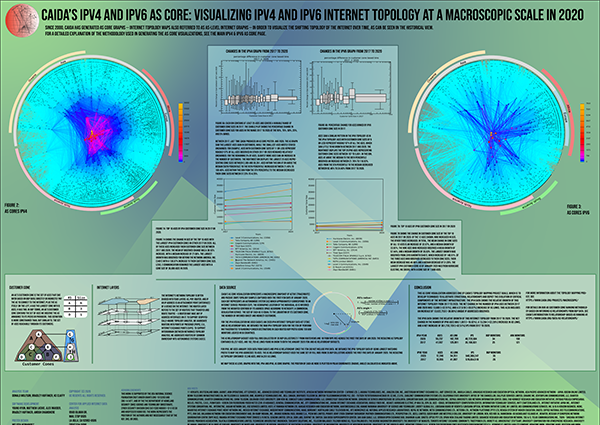
See the IPv4 and IPv6 AS Core in 2020 for details of our latest AS Core 2020 visualization, and download a poster of the latest AS Core visualization.
About the AS Core visualizations
Data Source
CAIDA's AS Core visualization represents a macroscopic snapshot of IPv4 and IPv6 Internet topology samples captured over the course of a year. The plot illustrates both the extensive geographical scope as well as rich interconnectivity of nodes participating in the global Internet routing system.Coordinated by our active measurement infrastructure, Archipelago (Ark), CAIDA collects data from monitors that probe paths toward millions of networks that cover a large portion of the routable prefixes seen in the Route Views Border Gateway Protocol (BGP) routing tables.
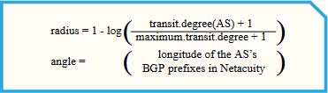
Figure 1. Coordinates of AS in AS core visualization.
We aggregate this IP-level data to construct IPv4 and IPv6 Internet connectivity graphs at the Autonomous System (AS) level. Each AS approximately corresponds to an Internet Service Provider (ISP). We map each observed IP address to the AS responsible for routing traffic to it, i.e., to the origin (end-of-path) AS for the IP prefix representing the best match for this address in BGP routing tables collected from Route Views.
The position of each AS node is plotted in polar coordinates (radius, angle) calculated as indicated in Figure 1, on the right.
AS ranking methodology
Starting from 2013 we have made two major refinements to how we create the graph, including how we rank individual ASes, improving our AS Core visualization.
- First, we now rank ASes based on their transit degree rather then their outdegree.
- Second, we now infer links across Internet eXchange (IX) point address space, rather than considering the IX itself a node to which various ISPs attach.
The examples below illustrate how these changes can affect the resulting data, using samples from our 2013 AS Core visualization.
1. Change in Ranking Metric From Outdegree to Transit Degree
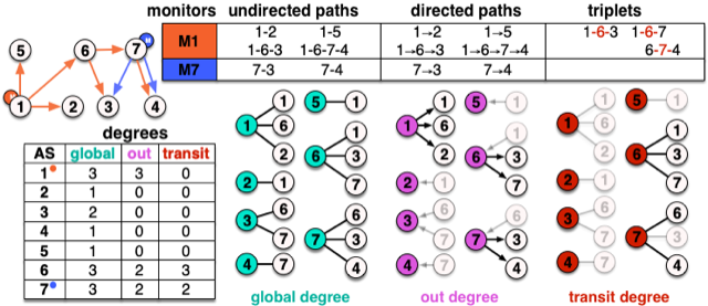
To place them on the graph, we originally sorted ASes by outdegree, which is the number of outbound links from an AS as observed in AS paths. In Figure 2, ASes 2, 3, 4, and 5 have an outdegree of 0, since nothing follows them in any path. ASes 6 and 7 have an outdegree of 2, while AS 1 has an outdegree of 3 only due to the monitor it hosts. Using transit degree instead drops AS 1's degree to 0, and differentiates 6, which provides transit for three ASes, from 7, which provides transit for only two.
2. Inferring links across IX Address Space
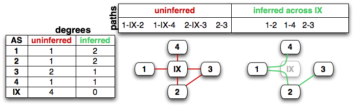
Our second substantial methodology change was that we infer links across IXes when the IX's address space appears in the traceroute. IXes provide infrastructure fabrics over which other ASes peer. Although the IX may have their own AS and address space, links that cross an IX's address space are actually peering links directly between the ASes connected to the IX, rather than to the IX itself. But raw traceroute data can include IP addresses used by an IX to facilitate this direct peering across the IX. Sometimes an AS might announce the IX's address space, in which case a simplistic mapping of these raw IP addresses to ASes will introduce false peering links between the AS announcing the IX's address space and ASes peering at the IX, as well as hide actual peering links between pairs of ASes on either side of the IX. To recover the true peering connectivity, we infer links across IX address space that is self-identified by the IX in PeeringDB. This new method does not always result in an increase in the degrees of ASes announcing IX address space. In figure 3, AS 3 already has a direct link to AS 2 at some other location, so inferring peering across the IX results in a loss of the link to the IX's AS, and no additional neighbors, resulting in a drop in degree for AS 3.
Quantifying the effects of these changes on IPv4 AS degree computations
We use box plots (in figures 4, 5, 7, 8, 10, 11, 12, and 13) to show the impact of the two changes in methodology on the resulting data. In each figure, we group ASes into bins of at least 25 with a given outdegree range; each bin is represented by one box-and-whisker plot, which delineates the range of change in degree when moving from an old method to a new method. The top of the box represents the 3rd quartile (75%), the line in the middle of the box is the 2nd quartile (50%), and the bottom of the box is the 1st quartile (25%). The whiskers represent 5% and 95%. We compute the percentages for this distribution as follows:
| box plot y = |
degree (old) - degree (new)
degree (old) |
|
Figure 4: In the IPv4 graph, more then 75% of ASes had a
larger transit degree then outdegree, although the relative change
decreased as the outdegree increased. For ASes with degree larger
then 20, an increasing fraction had transit degrees smaller than
their outdegrees.
|
Figure 5: Our second methodology change -- inferring IPv4 links across
the IX address space -- yielded modest change (usually an increase)
in transit degree for most degree ranges. ASes with moderate degrees
using the old method saw the largest percentage change with the new method.
The four ASes who dropped their degree over 90\% were either
IXes or announcing IX address space.
|
Figure 4 shows the change in AS degrees when switching from the use of outdegree to transit degree for IPv4 ASes. More then 75% of ASes had a larger transit degree then outdegree, although the relative change decreased as the outdegree increased. For ASes with outdegree larger then 20, an increasing fraction (but never above 25% of ASes in a bin) had transit degrees smaller than their outdegrees.
Figure 5 shows the percentage difference in transit degree when removing links connected to ASes announcing IPv4 IX address space, and adding AS links inferred across IX address space. The effect on transit degrees is subtle; ASes will both potentially lose links to IX address space and potentially gain new links across the IX. In our data, bridging inferences across the IX address space resulted in a loss of 5% of the existing IPv4 links, but yielded an additional 7,000 links (12% of the original), for a net 7% increase in links. Half of the ASes saw less than 10% change in their transit degree. ASes with moderate (between 100 and 360) transit degrees using the old method saw the greatest relative change to their transit degree. Among the top 50 ASes by the old method, 4 had their transit degree drop to less then 10% their old value (these 4 were IXes or announcing IX address space).
Figure 6 focuses on the top ten ASes, ranked by outdegree, transit degree, or transit degree given inferred links in the IPv4 graph. Hurricane Electric (AS 6639) was the only AS whose outdegree was significantly larger then its transit degree, probably due to the two Ark monitors they host. Hurricane Electric (AS 6639) also saw the most new links inferred across the IX address space, which increased its degree from 2,053 to 2,715 (32%). ReTN.net (AS 9002) saw its transit degree increase from 988 to 1,176 (19%). Most of these ASes had transit degrees within 1% of their outdegrees.
Effects on IPv6
|
Figure 7: In the IPv6 graph, 75% of ASes had transit
degree larger than their outdegree. Unlike in IPv4, 5% of ASes with
outdegrees larger than 5 had their transit degree drop almost to 0,
typically in cases where they were hosting an Ark monitor (which
increased their observed outdegree but would not affect transit
degree).
|
Figure 8: In the IPv6 graph, 75% of ASes had their transit degrees
increase when links were inferred across IX address space.
For the top 50 ASes by the old method, 4 of them (which were
either IXes or announcing IX address space) saw their degrees drop
to almost zero.
|
Figure 7 shows box plots of the percentage differences between degree and transit degree for ASes in the IPv6 graph. IPv6 sees an effect similar to the IPv4 graph: more then 75% of ASes had a larger transit degree then outdegree, although the relative change decreased as the outdegree increased. Unlike in IPv4, 5% of ASes with outdegrees larger than 5 had their transit degree drop almost to 0, typically in cases where they were hosting an Ark monitor (which increased their observed outdegree but would not affect transit degree). These ASes had a similar drop in the IPv4 graph, but the smaller size of the IPv6 graph increases their visibility.
Figure 8 shows that 75% of ASes had their transit degree increase when links were inferred across IX address space. For the top 50 ASes by the old method, 4 of them (3 IXes and an AS announcing IX address space) saw their degrees drop to almost zero. Half of all ASes had their degree change less than 25%.
Of the top ten ASes by transit degree in the graph where we treated IXes as nodes, Hurricane Electric's transit degree increased by 36% when we inferred links across the IX address space. As expected, the Amsterdam Internet Exchange (AS 1200) and the German Internet Exchange (AS 6695) saw the largest drop in transit degree when we removed links directly to IXes. Although Bharti Airtel (AS 9498) is not an IX, it was announcing an an IX's address space and so its transit degree dropped 88.4%. NORDUnet (AS 2603) and Next Layer Telecommunication (AS 1764) both joined the top 10, with transit degree increases of 155.8% and 269.2%, respectively. The larger role of IXes in the less mature IPv6 topology is reflected in the stronger effect their removal has on the degree-based AS ranking.
Summary of effects of two changes: Switching to Transit Degree and Inferring across IX's Address Space
|
Figure 10: In the IPv4 graph, the combined effect of switching from
outdegree to transit degree as inferred across IX address space
resulted in all low-degree (less than 10)
ASes increasing their degree, and most (75% of) remaining ASes
increasing or keeping the same degree. Some larger degree ASes
dropped degree dramatically, typically because they were IXes
or announced IX address space.
|
Figure 11: In the IPv6 graph, the combined effect of switching from
outdegree to transit degree as inferred across IX address space
decreased the degree for half of the top ASes ranked by outdegree.
|
In both IPv4 and IPv6, the most connected ASes experienced limited effects due to the change from outdegree to transit degree. In most bins, more than 75% of ASes increased their degree. IPv6's top bin (top 25 ASes by outdegree) was the exception, with over half decreasing their degree, due to the many IX ASes represented in this bin. In both IPv4 and IPv6, Hurricane Electric (AS 6939) saw its transit degree increase by over 30% when links were inferred across IX address space. Most other highly connected ASes in IP4 saw little change due to the IX node removal, but the IPv6 AS graph's top 10 saw significant change due to the larger role of IXes in the less mature IPv6 topology.
More information
This AS core visualization addresses one of CAIDA's topology mapping project goals: to develop techniques to illustrate structural relationships and depict critical components of the Internet infrastructure.
We rank ASes based on their transit degree rather then their outdegree. We infer links across Internet eXchange (IX) point address space, rather than considering the IX itself a node to which various ISPs attach. For more information about the topology mapping project, see: https://www.caida.org/projects/macroscopic/
For details on a more sophisticated methodology for ranking AS interconnectivity, based on inferring AS relationships from BGP data, see CAIDA's Introduction to Relationship-based AS Ranking at https://www.caida.org/catalog/datasets/as-relationships/.
Historical view of AS Core visualizations
We have prepared a historical view of AS Core visualizations including the latest AS Core currently available.
Additional Content
CAIDA's IPv4 and IPv6 AS Core: Visualizing IPv4 and IPv6 Internet Topology at a Macroscopic Scale in 2020
AS Core 2020 visualization.
AS Core: Visualizing IPv4 Internet Topology at a Macroscopic Scale in 2017
Since 2000, CAIDA has generated AS Core graphs in order to visualize the shifting topology of the Internet over time, as can be seen in the historical view. Presented below is CAIDA’s 2017 visualization of IPv4 Internet topology at the Autonomous System (AS) level.
IPv4 and IPv6 AS Core: Visualizing IPv4 and IPv6 Internet Topology at a Macroscopic Scale in 2015
Since 2000, CAIDA has generated AS Core graphs in order to visualize the shifting topology of the Internet over time, as can be seen in the historical view. Presented below is CAIDA’s 2015 visualization of both IPv4 and IPv6 Internet topology at the Autonomous System (AS) level.
IPv4 and IPv6 AS Core: Visualizing IPv4 and IPv6 Internet Topology at a Macroscopic Scale in 2012
Since 2000, CAIDA has generated AS Core graphs in order to visualize the shifting topology of the Internet over time, as can be seen in the historical view. Presented below is CAIDA’s 2012 visualization of both IPv4 and IPv6 Internet topology at the Autonomous System (AS) level.
IPv4 and IPv6 AS Core: Visualizing IPv4 and IPv6 Internet Topology at a Macroscopic Scale in 2013
Since 2000, CAIDA has generated AS Core graphs in order to visualize the shifting topology of the Internet over time, as can be seen in the historical view. Presented below is CAIDA’s 2013 visualization of both IPv4 and IPv6 Internet topology at the Autonomous System (AS) level.
IPv4 and IPv6 AS Core: Visualizing IPv4 and IPv6 Internet Topology at a Macroscopic Scale in 2014
Since 2000, CAIDA has generated AS Core graphs in order to visualize the shifting topology of the Internet over time, as can be seen in the historical view. Presented below is CAIDA’s 2014 visualization of both IPv4 and IPv6 Internet topology at the Autonomous System (AS) level.
IPv4 and IPv6 AS Core: Visualizing IPv4 and IPv6 Internet Topology at a Macroscopic Scale in 2011
Since 2000, CAIDA has generated AS Core graphs in order to visualize the shifting topology of the Internet over time, as can be seen in the historical view. Presented below is CAIDA’s 2011 visualization of both IPv4 and IPv6 Internet topology at the Autonomous System (AS) level.
IPv4 and IPv6 AS Core: Visualizing IPv4 and IPv6 Internet Topology at a Macroscopic Scale in 2010
Since 2000, CAIDA has generated AS Core graphs in order to visualize the shifting topology of the Internet over time, as can be seen in the historical view. Presented below is CAIDA’s 2010 visualization of both IPv4 and IPv6 Internet topology at the Autonomous System (AS) level.
IPv4 and IPv6 AS Core: Visualizing IPv4 and IPv6 Internet Topology at a Macroscopic Scale in 2009
Since 2000, CAIDA has generated AS Core graphs in order to visualize the shifting topology of the Internet over time, as can be seen in the historical view. Presented below is CAIDA’s 2009 visualization of both IPv4 and IPv6 Internet topology at the Autonomous System (AS) level.
IPv4 and IPv6 AS Core: Visualizing IPv4 and IPv6 Internet Topology at a Macroscopic Scale in 2005
Since 2000, CAIDA has generated AS Core graphs in order to visualize the shifting topology of the Internet over time, as can be seen in the historical view. Here we present a visualization of the AS-level IPv6 topology as observed on March 4th, 2005.
IPv4 AS Core: Visualizing IPv4 Internet Topology at a Macroscopic Scale in 2008
Since 2000, CAIDA has generated AS Core graphs in order to visualize the shifting topology of the Internet over time, as can be seen in the historical view. The 2008 version of the IPv4 AS Core visualization is presented below with analysis.
Animation of AS core over 18 months
Animation of AS core over 18 months from July 2000 to January 2002.
IPv4 AS Core: Visualizing IPv4 Internet Topology at a Macroscopic Scale in 2007
Since 2000, CAIDA has generated AS Core graphs in order to visualize the shifting topology of the Internet over time, as can be seen in the historical view. The 2007 version of the IPv4 AS Core visualization is presented below with analysis.
A Historical View of the AS Core
View of AS Core images over time. Versions of the AS core made at different times give a historical perspective on how the global Internet is changing.
Visualizing Internet Topology at a Macroscopic Scale
After the Internet experienced phenomonal growth in the 1990’s, tracking connectivity has become daunting. Recently, CAIDA researchers have attempted to strip away lesser connected autonomous systems (or `ASes’) in order to find out how Internet connectivity is distributed among ISPs.