

IPv4 and IPv6 AS Core: Visualizing IPv4 and IPv6 Internet Topology at a Macroscopic Scale in 2009
Since 2000, CAIDA has generated AS Core graphs -- Internet Topology Maps also referred to as AS-level Internet Graphs -- in order to visualize the shifting topology of the Internet over time, as can be seen in the historical view.
Presented below is CAIDA's 2009 visualization of both IPv4 and IPv6 Internet topology at the Autonomous System (AS) level.
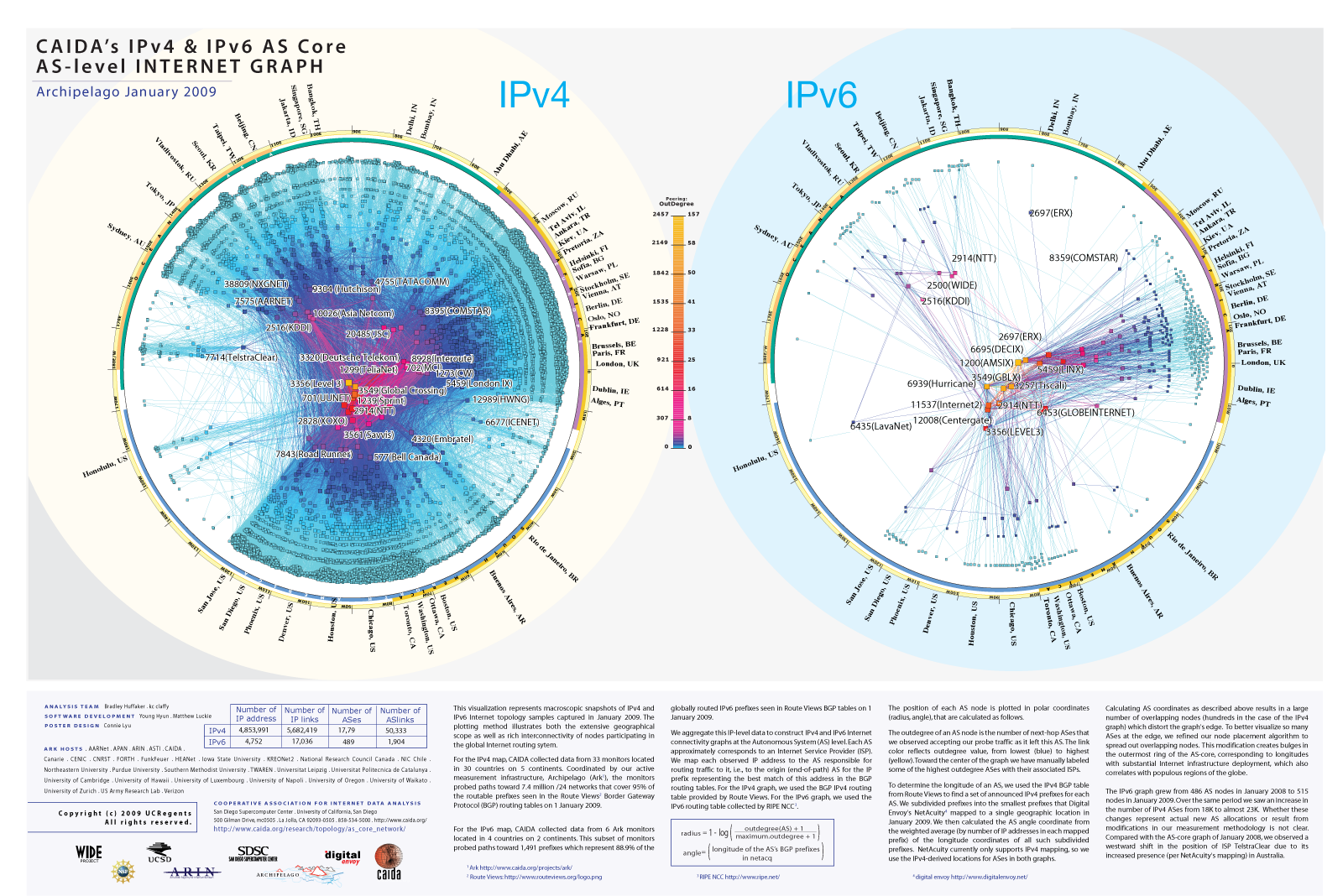
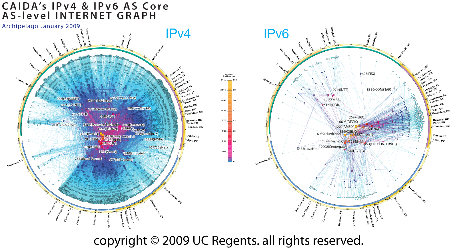 Figure 1. IPv4 and IPv6 AS Core January 2009.
Data Source
This visualization represents macroscopic snapshots of IPv4 and IPv6 Internet topology samples captured in January 2009. The plotting method illustrates both the extensive geographical scope as well as rich interconnectivity of nodes participating in the global Internet routing system.
For the IPv4 map, CAIDA collected data from 33 monitors located in 30 countries on 5 continents. Coordinated by our active measurement infrastructure, Archipelago (Ark), the monitors probed paths toward 7.4 million /24 networks that cover 95% of the routable prefixes seen in the Route Views Border Gateway Protocol (BGP) routing tables on 1 January 2009.
For the IPv6 map, CAIDA collected data from 6 Ark monitors located in 4 countries on 2 continents. This subset of monitors probed paths toward 1,491 prefixes which represent 88.9% of the globally routed IPv6 prefixes seen in Route Views BGP tables on 1 January 2009.
We aggregate this IP-level data to construct IPv4 and IPv6 Internet connectivity graphs at the Autonomous System (AS) level. Each AS approximately corresponds to an Internet Service Provider (ISP). We map each observed IP address to the AS responsible for routing traffic to it, i.e., to the origin (end-of-path) AS for the IP prefix representing the best match of this address in the BGP routing tables. For the IPv4 graph, we used the BGP IPv4 routing table provided by Route Views. For the IPv6 graph, we used the IPv6 routing table collected by RIPE NCC.
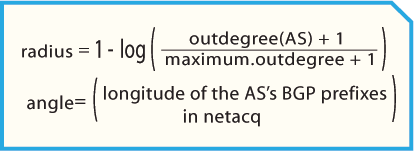
Figure 2. coordinates of AS in AS core.
The position of each AS node is plotted in polar coordinates (radius, angle) calculated as indicated in Figure 2, on the right.
The outdegree of an AS node is the number of next-hop ASes that we observed accepting our probe traffic as it left this AS. The link color reflects outdegree value, from lowest (blue) to highest (yellow). Toward the center of the graph we have manually labeled some of the highest outdegree ASes with their associated ISPs.
To determine the longitude of an AS, we used the IPv4 BGP table from Route Views to find a set of announced IPv4 prefixes for each AS. We subdivided prefixes into the smallest prefixes that Digital Envoy's NetAcuity mapped to a single geographic location in January 2009. We then calculated the AS angle coordinate from the weighted average (by number of IP addresses in each mapped prefix) of the longitude coordinates of all such subdivided prefixes. NetAcuity currently only supports IPv4 mapping, so we use the IPv4-derived locations for ASes in both graphs.
Calculating AS coordinates as described above results in a large number of overlapping nodes (hundreds in the case of the IPv4 graph) which distort the graph's edge. To better visualize so many ASes at the edge, we refined our node placement algorithm to spread out overlapping nodes. This modification creates bulges in the outermost ring of the AS-core, corresponding to longitudes with substantial Internet infrastructure deployment, which also correlates with populous regions of the globe.
The IPv6 graph grew from 486 AS nodes in January 2008 to 515 nodes in January 2009. Over the same period we saw an increase in the number of IPv4 ASes from 18K to almost 23K. Whether these changes represent actual new AS allocations or result from modifications in our measurement methodology is not clear. Compared with the AS-core graph of January 2008, we observed a westward shift in the position of ISP TelstraClear due to its increased presence (per NetAcuity's mapping) in Australia.
Conclusion
One of CAIDA's topology mapping project goals is to develop techniques to illustrate relationships and depict critical components of the Internet infrastructure. For more information about the topology mapping project, see: https://www.caida.org/projects/macroscopic/
For more information on methodology for ranking AS interconnectivity, see CAIDA's Introduction to Relationship-based AS Ranking.
Demonstration
If you would like to try out a demo of the CAIDA tools used to construct this graph, please see https://www.caida.org/projects/internetatlas/gallery/ascore/demo.
Poster
 PNG
PNGAcknowledgments
CAIDA Topology Mapping Analysis Team: Brad Huffaker, kc claffy
Software Development: Young Hyun, Matthew Luckie
Poster Design: Jennifer Hsu