

Source: skitter-f.isc.org (204.152.184.98) - 8 october 1999
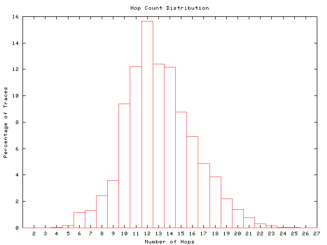
figure 1: hop count distribution (query 'wing spans')
|
||
| Average = 13.11 | Sigma = 3.04 | |
This graph shows how many paths of a given length (hop count) are seen in our data. For each destination there may be multiple paths due to routing changes; here we have plotted the most frequent path for the destination. The shape of the distribution reflects the position of the source with respect to the destinations it probes. If the graph were very flat and long at the left edge, it would mean that the root server is not located at the edge of its internal network. This server is relatively close (hop count wise) to its clients. skitter hosts at other sites probing more global destination sets have seen paths with hop counts above 30. skitter truncates paths at 30 hops since in today's Internet very few are longer than 30 hops.
figure 2: RTT vs hop count (... --> weak correlation)
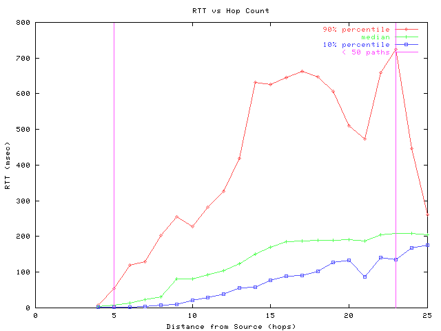
Figure 2 shows round trip time (RTT) as a function of hop count. For each destination the most frequent path is chosen and put into a hop-count bin based on its length. From these bins, the 10th, 50th, and 90th percentiles of RTT are calculated and plotted in Figure 2. Data points outside the vertical lines are not statistically meaningful because they are derived from too few samples (less than 50 paths).
The RTT depends on the distance to the destination as well as the bandwidth and congestion along the path. The speed of light in the cable media is a fixed component of RTT; delays in routers due to forwarding lookups, queueing, and other processing vary. The 10th percentile and median lines in the graph tend to be positively correlated with hop count, with median values about twice as large as 10th percentile values. There is a larger disparity between the median and 90th percentile values which reflects the long tail typical of RTT distributions (see figure 3).
figure 3: RTT distribution (trimodal)
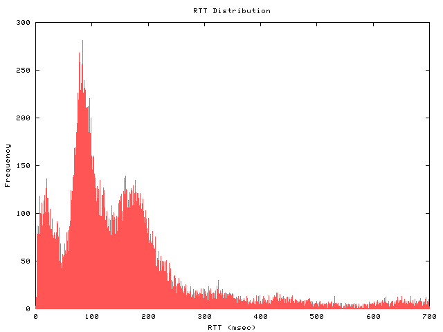
This figure displays the distribution of the average round trip time for the most frequent path to each destination. The x-axis is cut off at 700 msec, beyond which the number of paths is low.
The overall distribution depends on the topological and geographic distance from the skitter source host to the destinations, and on the conditions of the Internet. For most of our skitter sources, three prominent RTT peaks are present, corresponding to three major geographical domains of destinations: east and west coasts of the United States, and Europe. This particular skitter box is located in Palo Alto, California. The round-trip-times that make up the leftmost (and shortest) peak of this distribution (around 30 msec on the x-axis) are generally to destinations on the west coast. East coast destinations have larger RTTs, represented by the second peak (around 100 msec). The third peak around 200 msec represents RTTs to a cluster of European and South American destinations. Asis is represented in the tail of the distribution; not many hosts in Asia query this root nameserver in California rather than the root server in Japan.
figure 4: RTT vs geographic longitude
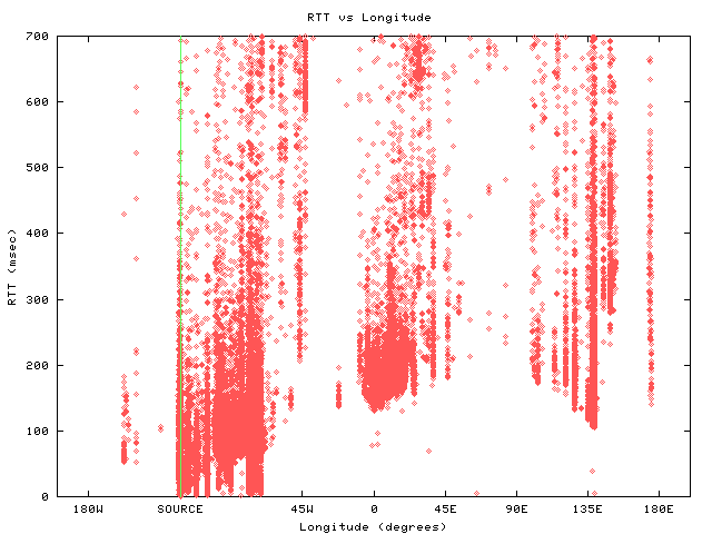
Figure 4 explores the correlation between RTT and geographical location of destinations. We use longitude on the x-axis to characterize the position of the target destinations on the globe. Longitude yields a useful approximate measure of the actual distance between the source and destinations because much of the telecommunications infrastructure (e.g. transoceanic links) goes in the East-West direction, rather than North-South. (There are not many links crossing the north or south poles.) This visualization also provides a convenient separation of countries and continents.
The graph shows major clusters of users on the east and west coasts of the United States (about 75 and 125 degrees West, respectively), in Europe (5 degrees West to 30 degrees East) and in Asia (100 to 140 degrees East). The vertical line shows the position of the skitter host in Palo Alto, California.
With a little imagination, we can see diagonal lines formed by the envelope of the minimum RTTs at each longitude. The lines start at 0 near the source (about 125W), go up to about 75E and then go back down again (wrapping around the display) to the source. There are some outliers at about 80W. The triangle formed by these diagonal lines represents minimum RTT values for destinations at any particular longitude. The RTT values on this triangual shape are about 3 times the theoretical minimum (a value representing the speed of light in fiber between the source and that longitude). Destinations with RTT values below these diagonal lines (outliers) have incorrect geographical locations in our database. For example, some destinations ascribed to the east coast of the US based on our whois or other locative heuristics, must in fact be on the west coast.
High RTT values generally suggest a distant destination, a slow link to a destination, or a congested path. For destinations primarily north or south of the source, the longitude representation is misleading because it underestimates the actual distance. In this case, the RTT data points appear too high on the graph. For example, many of the points at 45 degrees West represent destinations in Brazil and their RTT values seem to be higher than the longitude model used here would predict. Note that if we use the actual (two-coordinate-based) geographic distance instead of longitude on the x-axis for this figure, then Brazil destinations would be in the middle of the European cluster.
Table 1: probability of changing autonomous systems along a path
View Table 1: probability of changing autonomous systems along a path
Table 1 sorts paths by path length (shown vertically) and for each length, lists the links in the path and shows the probability of a path crossing a boundary between Autonomous Systems (ASes) at that link. Probabilities are colored to help highlight their values: low (blue), medium (green) and high (red). We can infer some peering and routing policy relationships from these data.
For the first few links (two, in this particular example) the probability of an AS switch is zero, since these first hops are internal to the site where the skitter host is located. Then, in this example at hop 3, all packets change to the autonomous system (AS) of the source site's upstream providers. Upon identifying the actual ASes in the paths, we see that longer paths often have a block of consecutive hops in the middle within the same AS, and then fan out to many individual ASes closer to the destination. This is more readily seen in Table 2, where we record the AS switched to and the percentage of paths that switched to it.
The level of aggregation of the data displayed makes drawing any more specific conclusions difficult.
Table 2: identification of ASes dominating the paths
View Table 2: identification of ASes dominating the paths
Table 2 lists the most prevalent AS number at each hop with the most popular ASes colored according to the key above the table. The number in parentheses is the proportion of paths at that hop that belong to the listed AS. Rows of the table that seem to contain routing inefficiencies, for example, going from one AS to a second and then back to the first, are probably not routing mistakes. The data we display is aggregated, so the AS listed is the most prevalent one at that hop for a particular path length, but not the only AS present in the data.
The table is constrained because paths are sorted by path length (number of hops in the path). The next two images relax this constraint, but try to capture this same information.
Figure 5: dispersion along IP paths: by autonomous system boundaries
click for larger image
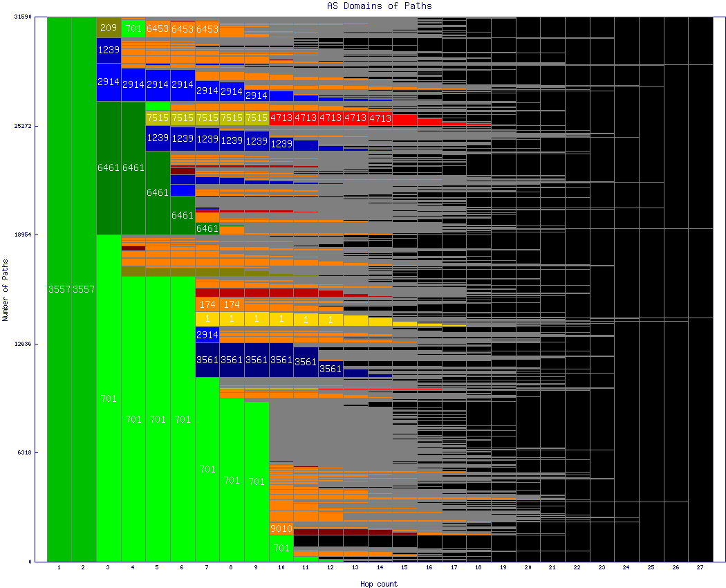
In this image, we aggregated and sorted the paths by AS number at each hop, rather than maintaining the path length ordering used in the tables above. The ASes with the most paths are at the bottom of each hop count bin in the graph. When the number of paths in a given AS is sufficient, we color the horizontal bar representing those paths with that AS's color. A single path goes horizontally all the way across the page, with the AS colors and designations identifying its common initial subpath with other paths. Three colors do not represent real ASes:
- Orange, which is a catch-all color for ASs that are too infrequent to receive their own color assignment. Orange in one horizontal line of the graph is all the same AS, but is a different AS from orange in different horizontal line.
- Grey is used between color blocks and when those blocks are very thin (a few pixels) only the grey is visible. It represents the fan out that occurs close to destinations.
- Black, which represents "none" and means that the path has reached its destination (i.e., path lengths less than 30 hops).
Figure 6: dispersion along IP paths: by country boundaries
click for larger image
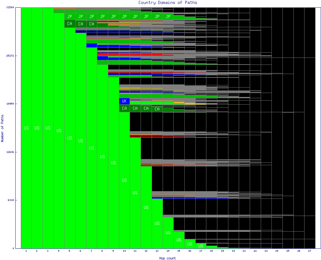
Figure 6 is similar to figure 5 but using country boundaries instead of AS boundaries. Most paths are entirely contained within the US, unsurprising since the target list represents clients of the F root server, which is located in Palo Alto, California. Zooming in reveals paths to Canada, the United Kingdom, and Japan. Other countries are also represented but with so few paths that while their colors are shown, labels would not fit and so no identification is given. The same special meanings apply for colors orange, grey and black.
Future analysis
As described in the skitter home page, we would like to compare the data acquired from skitter-f.isc.org to skitter sources at other existing and potential root server sites. Our goal is how to determine and describe the `proximity' of a given source (by hop count or median RTT or some combination of the two) to a set of client destinations. We hope to launch three more skitter probes at collaborating root server sites by December 1999.