

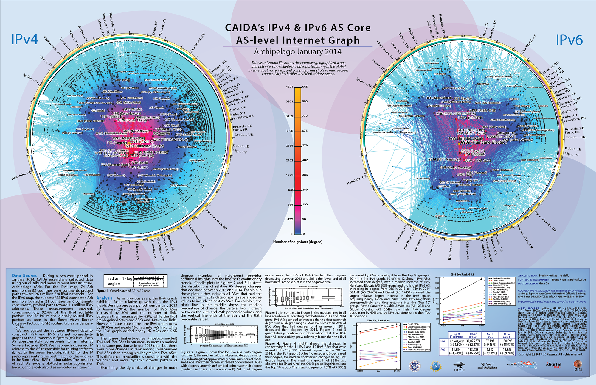
IPv4 and IPv6 AS Core: Visualizing IPv4 and IPv6 Internet Topology at a Macroscopic Scale in 2014
Since 2000, CAIDA has generated AS Core graphs -- Internet Topology Maps also referred to as AS-level Internet Graphs -- in order to visualize the shifting topology of the Internet over time, as can be seen in the historical view.
Presented below is CAIDA's 2014 visualization of both IPv4 and IPv6 Internet topology at the Autonomous System (AS) level.
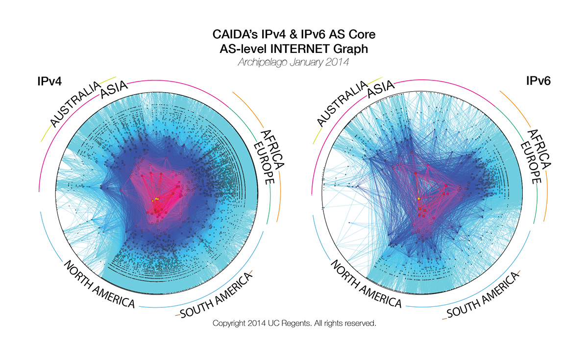
Figure 1. IPv4 and IPv6 AS Core Jan 2014.
Data Source
This visualization represents a macroscopic snapshot of IPv4 and IPv6 Internet topology samples captured in 2014. The plot illustrates both the extensive geographical scope as well as rich interconnectivity of nodes participating in the global Internet routing system.
For the IPv4 map, CAIDA collected data from 74 monitors in 33 countries on 6 continents. Coordinated by our active measurement infrastructure, Archipelago (Ark), the monitors probed paths toward 263 million /24 networks that cover 92.4% of the routable prefixes seen in the Route Views Border Gateway Protocol (BGP) routing tables in January 2014. For the IPv6 map, CAIDA collected data from 33 IPv6-connected Ark monitors located in 21 countries on 6 continents. This subset of monitors probed paths toward 3.3 million IPv6 addresses, which represent 76.1% of the globally routed IPv6 prefixes seen in Route Views BGP tables in January 2014.
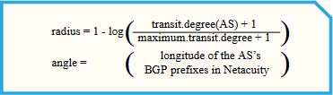
Figure 2. Coordinates of AS in AS core visualization.
We aggregated this IP-level data to construct IPv4 and IPv6 Internet connectivity graphs at the Autonomous System (AS) level. Each AS approximately corresponds to an Internet Service Provider (ISP). We map each observed IP address to the AS responsible for routing traffic to it, i.e., to the origin (end-of-path) AS for the IP prefix representing the best match for this address in BGP routing tables collected from Route Views.
The position of each AS node is plotted in polar coordinates (radius, angle) calculated as indicated in Figure 2, on the right.
Methodology
For a detailed explanation of the methodology used in generating AS Core visualizations, see the main IPv4 & IPv6 AS Core page.
Changes in the graph since 2013
As in previous years, the IPv6 graph exhibited faster relative growth than the IPv4 graph. During a one year period from January 2013 to January 2014, the number of IPv6 ASes increased by 80% and the number of links between them increased by 63%, while the IPv4 graph gained 9% more ASes and 14% more links. However, in absolute terms, the IPv4 graph grew by 3k ASes and nearly 16k new inter-AS links, while the IPv6 graph added nearly 2k ASes and 5.5k links.
The three highest-degree (most-connected) IPv4 and IPv6 ASes in our measurements remained in the same position as in our 2013 data, but there were more changes in rank among lower-ranked IPv6 ASes than among similarly ranked IPv4 ASes. This difference in volatility is consistent with the younger and more dynamic growth pattern of IPv6.
Examining the dynamics of changes in node degrees (number of neighbors) provides additional insights into the Internet's evolutionary trends. Candle plots in Figures 3 and 4 illustrate the distributions of relative AS degree changes that occured between 2013 and 2014. Each bin in those plots either includes all ASes that had the same degree in 2013 data or spans several degree values to include at least 25 ASes. For each bin, the black line in the middle shows the median percentage of change, the vertical box is drawn between the 25th and 7th percentile values, and the vertical line ends at the 5th and the 95th percentile values.
|
Figure 3. IPv4 2013.01.01 transit degree inferred across IX address space
|
Figure 4. IPv6 2013.01.01 transit degree inferred across IX address space
|
Figure 3 shows that for the IPv4 ASes with degree less than 6, the median value of observed degree changes is 0, indicating that approximately equal numbers of those small ASes had their degree increased or decreased. ASes with degrees larger than 6 tended to increase their degree (medians in these bins are above 0). Yet in all degree ranges more than 25% of IPv4 ASes had their degrees decreasing between 2013 and 2014: the lower end of all boxes in this candle plot is in the negative area.
In contrast, in Figure 4, the median lines in all bins are above 0 indicating that between 2013 and 2014 more IPv6 ASes tended to increase than to decrease their degrees in all degree ranges. Moreover, less than 25% of IPv6 ASes that had degrees of 4 or more in 2013, decreased their degrees by 2014. Figures 2 and 3 rm our observation that the IPv6 inter-AS connectivity grew relatively faster than the IPv4 one.

Figure 5. IPv4 Top Ranked AS
|
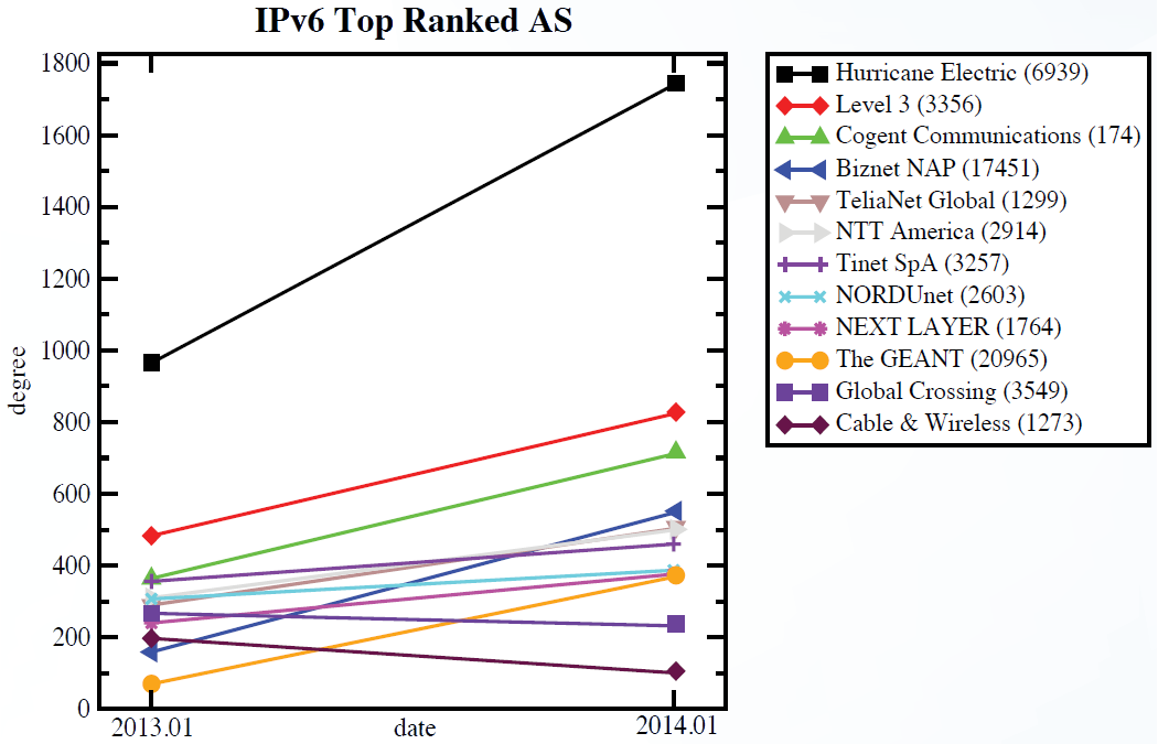
Figure 6. IPv6 Top Ranked AS
|
Figure 5 and 6 show the changes in connectivity for the 11 IPv4 and 12 IPv6 ASes that were ranked in the "Top 10" by transit degree in either 2013 or 2014. In the IPv4 graph, 8 ASes increased and 3 decreased their degree, the median of observed changes being 17% degree increase. The maximum growth of 321% was observed for Bharti Airtel (AS 9498) propelling this AS into the Top 10 group. The transit degree of RETN (AS 9002) decreased by 22% removing it from the Top 10 group in 2014. In the IPv6 graph, 10 of the 12 shown IPv6 ASes increased their degree, with a median increase of 70%. Hurricane Electric (AS 6939) remained the largest IPv6 AS, increasing its degree from 966 in 2013 to 1740 in 2014. GEANT (AS 20965) and Biznet (AS 17451) showed the largest relative degree increase in the IPv6 space, acquiring nearly 425% and 244% new IPv6 neighbors correspondingly, and thus entering into the "Top 10" group. At the same time, Cable & Wireless (AS 1273) and Global Crossing (AS 3549) saw their IPv6 degree decreasing by 49% and by 13% therefore losing their Top 10 positions.
Conclusion
This AS core visualization addresses one of CAIDA's topology mapping project goals is to develop techniques to illustrate structural relationships and depict critical components of the Internet infrastructure. These IPv4 and IPv6 graphs show the relative growth of the two Internet topologies, and in particular the steady continued growth of the IPv6 topology. Although both IPv4 and IPv6 topologies experienced a lot of churn, the net change in number of ASes was 3,115 (+9.13%) in our IPv4 graph and 1,918 (+79.36%) in our IPv6 graph.
For more information about the topology mapping project, see: https://www.caida.org/projects/macroscopic/
For details on a more sophisticated methodology for ranking AS interconnectivity, based on inferring AS relationships from BGP data, see CAIDA's Introduction to Relationship-based AS Ranking at https://www.caida.org/catalog/datasets/as-relationships/.
Demonstration
If you would like to try out a demo of the CAIDA tools used to construct this graph, please see https://www.caida.org/projects/internetatlas/gallery/ascore/demo.
Poster
(PNG image) (PDF in 3:2 aspect ratio or 7:4 aspect ratio)
Acknowledgments
CAIDA
Topology Mapping Analysis Team: Brad Huffaker, kc claffy
Software Development: Young Hyun, Matthew Luckie
Poster
Design: Hanh On