

Features
The Graphical User Interface is divided into two sections with the top section showing a map and the lower section displaying the traditional Traceroute output. The user can zoom into various regions of the maps. Users also have the option of adding their own maps to the tool.
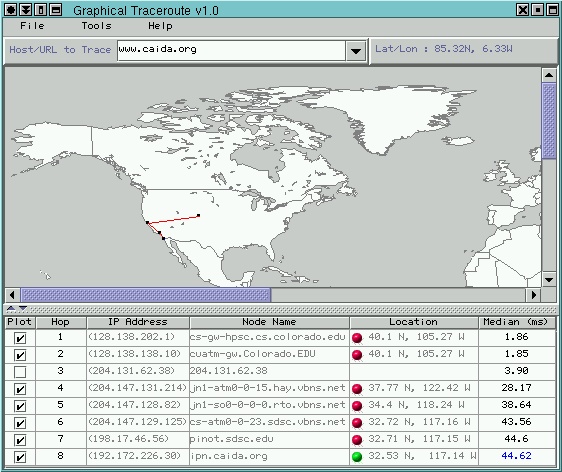
The snapshot above shows a traceroute that was executed from CAIDA in San Diego to University of Utah. The color of the lines on the map indicate the accuracy of the location obtained for the end-points.
The table consists of six columns, the first column provides the user with a checkbox that is turned on for each point that is plotted on the map. The user can disable any checkbox and the corresponding point will be skipped on the map.
The second, third and fourth columns hold the hop number, IP address, and host name that is displayed in the traditional traceroute ouput. Columns three and four have the added functionality that they provide 'whois' information of the node when selected.
Column five indicates the location that was obtained for each hop. There is also a small colored ball that indicates which search step determined the location. Clicking on this column will provide the user with information as to how that location was obtained.
The last column indicates the smallest of the round trip times. The color indicates how many packets timed out, a value in black indicates that no packets timed out, value in blue indicates that one packet timed out and a value in red indicates that two or more packets timed out. If all packets timed out, then there is no entry in any of the columns for the corresponding hop.