The contents of this legacy page are no longer maintained nor supported, and are made available only for historical purposes.
Internet Atlas Gallery
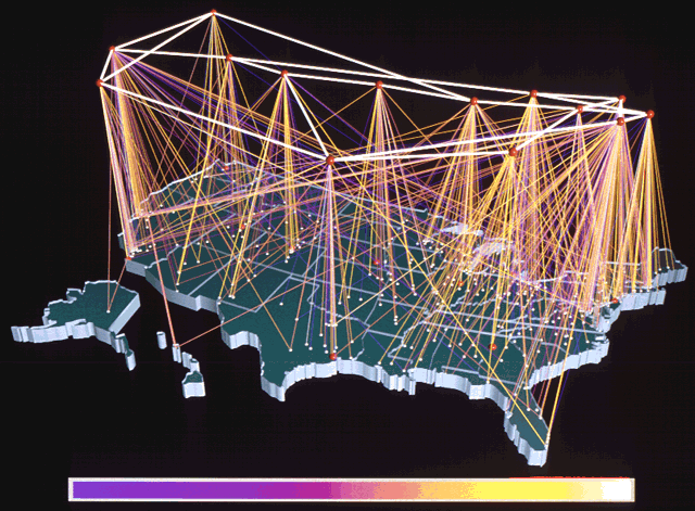
NSFNET growth until 1995
Donna Cox and Robert Patterson
The National Center for Supercomputing Applications (NCSA),
National Science Foundation's Supercomputer Centers Program
University of Illinois at Urbana-Champaign
URL: http://www.ncsa.illinois.edu
| Visualization Thumbnail |
About the Visualization |
|
|
Visualization Techniques:
(Technique1): Backbone nodes are elevated above the geographical
map to imply that all data transfer must first travel up to the backbone,
then back down to its final destination elsewhere on the map.
Backbone nodes are also represented as red spheres at their geographic position
on the map of the USA.
Client nodes appear as white spheres placed geographically on the map.
(Technique2): Each line between the backbone nodes and their
clients indicates geographical location as well as traffic volume.
|
Key Visualization Mappings:
(Mapping1): Connections are colored by volume of traffic,
according to the color key below the image. Purple lines show the
least traffic while white lines show the most.
(Mapping2): Node type is depicted by color.
Red spheres represent backbone nodes. White spheres
represent clients.
|
|
| Click Image for Full-Size Visualization
|
Back |